Portable WYSIWYG Web Builder PRO 11.1.2 Full
This post was published 8 years ago. Download links are most likely obsolete. If that's the case, try asking the uploader to re-upload.
Portable WYSIWYG Web Builder 11.1.2 Full|Windows(x86/x64)|rar|39.2 mb
WYSIWYG Web Builder 10 is a WYSIWYG (What-You-See-Is-What-You-Get) program used to create web pages. WYSIWYG means that the finished page will display exactly the way it was designed.
Attention!
Dear users! We do not forget about our rights holders!
All portable assembly, designed exclusively for the promotion of the software and can be used for informational purposes only!
After testing the program and decide on the usefulness and necessity of you, this software - you are required! remove the assembly and turn to the developer, to purchase a license for a full version. Good luck!
Now available: WYSIWYG Web Builder 11!
• Visually design your website (What-You-See-Is-What-You-Get).
• No HTML knowledge required! Just drag & drop objects to the page!
• Outputs standard HTML4, HTML5, XHTML, CSS3, PHP.
• Template support (100+).
• HTML5 Audio/Video, YouTube, Flash Video and more!
• Slidehows, photo galleries, rollover images, rollover text.
• Navigation bars, Menu bar and many other navigation options.
Desktop publishing for the web, build web sites as easy as Drag & Drop!
• One Click Publishing" No FTP program needed. No special hosting required, use with any Hosting Service!
• Easily create forms using the built-in Form Wizard plus Form validation tools and built-in CAPTCHA.
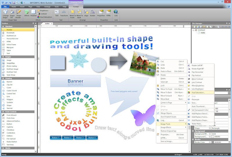
• Advanced graphics tools like shapes, textart, rotation, shadows and many other image effects.
• Fully integrated jQuery UI (Accordion, Tabs etc), animations, effects and built-in ThemeRoller theme editor.
• Google compatible sitemap generator / PayPal eCommerce Tools
• Many navigation tools available: Navigation bars, tab menus, dropdown menus, sitetree, slidemenus.
• Built-in Slide Shows, Photo Galleries, Rollover images, Banners etc.
• Support for YouTube, Flash Video, Windows Media Player and many other video formats.
• Unique extension (add-on) system with already more than 250 extensions available!
WYSIWYG Web Builder 10 Feature Highlights
- Responsive Web Design (New!)
- CSS3 Animations (New!)
- Navigation (New!)
- Productivity (New!)
- Mobile Web Design (New!)
- jQuery Mobile (New!)
- Other new objects (New!)
- More than 100 New Features!
Whats New
- Fixed: Crash when using image frames in layout grid.
- Fixed: Re-opening page with layout grid uses wrong view pointer.
- Fixed: Rollover animations in centered layout grid are left aligned.
- Fixed: Table cell alignment not applied to all selected cells.
- Improved: Google Maps script now has fixed height in Layout grid.
- Improved: parallax/cover is removed when selecting different background mode.
- Improved: background-attachment will be set to 'scroll' when parallax is disabled in breakpoints.
- Improved: Added playlist parameter in YouTube when using loop option.
Responsive Web Design
- New feature: Added support for responsive styles in Style Manager. Sometimes you want to use a different font, text size or color in breakpoints. For example use a larger font for smaller screens. With Responsive Styles you can define different values for breakpoints.
- New feature: Responsive styles in objects. Most objects now can have different fonts in breakpoints. Most objects can also have different backgrounds and text colors. Some objects like the photo gallery, text and the blog can have different columns in breakpoints.
Which properties of an object are responsive is documented in the help.
- New feature: Responsive background styles in pages. You can configure different background properties for breakpoints, so a mobile layout can have a different background color or image.
Layout Grid
- New feature: Layout Grid. The Layout Grid can be used to create flexible multi column layouts that automatically adapt to the screen size. A grid can have up to 12 columns, with sizes in percentages. Objects that are dragged into a grid will automatically become floating.
For smaller (mobile) screens all columns are stacked based on the defined breakpoint.
This is a great new way to create flexible and responsive (Bootstrap-like) layouts!
Most WWB objects have been redesigned to take advanced of the layout grid.
For example, if an image is dragged into the layout grid then it will automatically become responsive: it uses the full width of the cell while keeping its aspect ratio. Text will always use the full width of the grid cell and YouTube videos can be configured to keep a 16:9 or 4:3 ratio while stretching.
The grid can be configured as fixed or fluid layout. A fixed grid will have the design time width and be centered in the browser window. A fluid grid will use the full width of the browser window and resize all cells accordingly.
Lazy Loading
- New feature: Lazing loading. Enable this option to delay the loading of images until they are visible in the view port. This will speed up the page loading. It also prevents loading large images in mobile devices because only the visible images will be downloaded.
Lazy loading is currently available for the Image object, Photo Gallery, Rollover Image and Rollover text.
FontAwesome Icon
- New feature: Added 'FontAwesome Icon' object to easily add awesome (vector) icons.
The object supports hover, backgrounds, events, links, CSS3 animations and much more.
Layer Menu
- New feature: Layer Menu.
A Layer Menu is an advanced menu where the drop down menus are layers. This is great for creating advanced mega menus with images, text, form or any other object! The drop down layer can be positioned left, centered or at the right of the buttons. It is also possible to make the layer full width of the page.
Breadcrumb
- New feature: Added 'Breadcrumb' navigation.
Breadcrumbs are used to enhance the accessibility of a website by indicating the location using a navigational hierarchy.
You can either manually configure all links for the menu or automatically synchronize with Site manager. Also supports FontAwesome icons.
Pagination
- New feature: Added 'Pagination' navigation.
If you have a web site with lots of pages, you may wish to add the pagination object for easier navigation. You can either manually configure all links for the menu or automatically synchronize with Site manager. In that case the menu will automatically generate links with auto numbering and next/previous buttons.
This menu also works with the Content Management System.
Responsive Menu
- New feature: Added 'Responsive Menu' object.
This is a responsive, multi-level menu optimized for desktop computers and mobile (touch) devices which uses CSS only (no JavaScript!). On desktop computer the menu will display a standard drop down menu and on mobile devices it will display a multi-level stacked menu with the common ‘hamburger’ icon. The menu supports FontAwesome icons, ScrollSpy and Affix to give your website a modern look and feel.
ScrollSpy
- New feature: ScrollSpy is a navigation mechanism that automatically highlights the navigation buttons based on the scroll position to indicate the visitor where they are currently on the page. This feature works in combination with bookmarks.
ScrollSpy is available for CSS Menu, Navigation Menu, Mega Menu, Slide Menu, Tab Menu, Panel Menu, Responsive Menu and Text Menu.
Affix
- New feature: Added Affix option to navigation objects.
The Affix functionality is often used with navigation menus to make them "stick" at a specific area while scrolling up and down the page.
Affix is available for CSS Menu, Navigation Menu, Mega Menu, Slide Menu, Tab Menu, Responsive Menu and Text Menu.
Heading
- New feature: Added a dedicated 'Heading' object.
This is a quick way to add headings (<h1>, <h2>) without using styles. Each heading object can have its own fonts/size/color!
Blog
The blog has been redesigned to make it much more powerful. It’s now a great way to quick create lists or (responsive) grids for all types of data.
- New feature: Added 'Layout' option. This controls the appearance of the blog items. Includes more than 10 different layouts! More layouts will be available as an add-on package. You can also create your own layouts (with HTML/CSS templates)
- New feature: Added ‘Carousel’ option to the Blog. When this option is active the blog items will be displayed in a (responsive) Carousel!
- New feature: Item links now support target (new window, lightbox, popup etc), URL parameters, title, mailto, SMS, phone number, file etc.
- New feature: Added possibility to insert Lorem Ispum in blog via context menu.
- New feature: Added text alignment.
- New feature: Added line-height property.
- New feature: Added option to specify the image width.
- New feature: Added the ability to display items in columns. This option is responsive so each breakpoint can have different number of columns.
Article
- New feature: Added 'Article' object. Basically the Article object is a stripped down version of the blog, with just one 'article. The article supports the same layouts and styling option so that makes it a great building block for when you need text combined with an image.
Parallax
- New feature: Added 'parallax' background mode to Layers, Forms, Layout Grid and other objects. The background image scrolls slower than the content in the foreground, creating the illusion of 3D depth.
jQuery ListView
- New feature: Added 'ListView object'. Create beautiful styled (jQuery UI themable) lists with title, description and image. Two modes are supported: listview and droplist. Also supports dividers to group items.
And more....
Homepage
System Requirements
IBM or compatible Pentium/AMD processor (900 MHz or greater), 512 MB RAM or greater. 1024 x 768, 16-bit display (32-bit recommended)
Windows XP, Windows Vista all SP, Windows 7
Language Multilanguage(Russian English)
Download :Portable (Size:39.2 mb)