Data Visualization with Python: Crash Course


Instructors: Pranjal Srivastava
5 sections • 12 lectures • 53m total length
Video: MP4 1280x720 44 KHz | English + Sub
Updated 11/2021 | Size: 293 MB
Learn to build interactive charts with Plotly and Python asap
What you'll learn
Learn to create interactive charts with Plotly
Learn to build dummy datasets like Fake Stock market price simulator
Learn to create vertical and horizontal bar charts
Learn to create vertical and horizontal grouped and stacked bar charts
Learn to create scatter charts
Learn to create line charts
Learn to create time series charts
Learn to create pie, donut and sunburst charts
Learn to create financial charts like candlestick, OHLC and waterfall charts
Learn to create multiple line charts
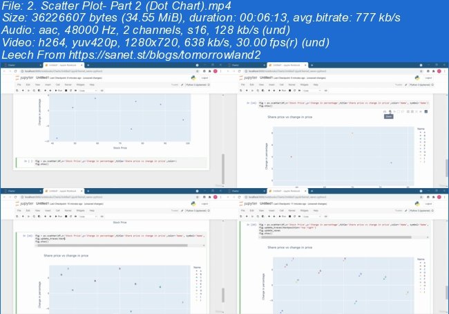
Learn to create bubble and dot charts
Learn to use Plotly dash to integrate charts into web application
Learn to use chart studio
Show more
Show less
Requirements
A desire to transform complicated data into beautiful chartsA little bit knowledge on python programming languageMust have Jupyter and other required packages and libraries
Description
Data Visualization is one of the indispensable topic in Data Science and Machine learning. It is process of creating interactive visuals to understand trends, variations, and derive meaningful insights from the data. We all know that Data is the new oil. Likewise if oil is not processed it is of no use and to derive relevant insights from data for making critical business decisions, it should be in cleaned and processed.
Data visualization make this task little bit more handy and fast. With the help of visual charts and graph, we can easily find out the outliers, nulls, random values, distinct records, the format of dates, sensibility of spatial data, and string and character encoding and much more.
In this learning course, you will be learning different charts to represent different kind of data like categorical, numerical, spatial, textual and much more.
Bar Charts (Horizontal and Vertical)
Line Charts
Pie Charts
Donut Charts
Scatter Charts
Grouped Bar Chart (Horizontal and Vertical)
Segmented Bar Chart (Horizontal and Vertical)
Time and series Chart
Sunburst Chart
Candlestick Chart
OHLC;Charts
Bubble Charts
Dot Charts
Multiple Line Charts and so on.
Homepage
Screenshots
~~~~ Welcome to my Blogs ~~~~
Do not forget to check it every day!
If You should find any files not found, please PM me~Download Download: Best Software for All
~Tomorrowland2: Video Training
~Pluralsight Tutorials: All Pluralsight Videos
~EbookSA: Best Ebooks
~Graphic World: Best Graphics
Download from free file storage
Resolve the captcha to access the links!
Registered members don't get captcha ... just sayin